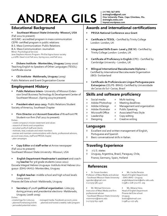
Choosing the Right Cover Letter Font
Your cover letter is your first impression. It’s your chance to make a statement before the potential employer even looks at your resume. And while the content is important, the aesthetic is equally crucial. One often-overlooked aspect of crafting a compelling cover letter is the font. The right font can significantly enhance readability, project professionalism, and ultimately, increase your chances of landing an interview. This guide will delve into the best fonts to use for cover letters, ensuring your application stands out for all the right reasons. We will also explore several key considerations when selecting a font, from its impact on first impressions to the importance of readability.
The Importance of Font Choice
The font you choose for your cover letter communicates a lot about you. It can subtly convey your attention to detail, your professionalism, and your understanding of workplace norms. A well-chosen font demonstrates that you care about every aspect of your application. It shows the recruiter that you’re meticulous. This attention to detail is what will help you leave a lasting impression. It is essential to give proper attention to what could otherwise be overlooked. Your font choice is part of the package of you and your ability to communicate, which is vital to the job application process.
Impact on First Impression
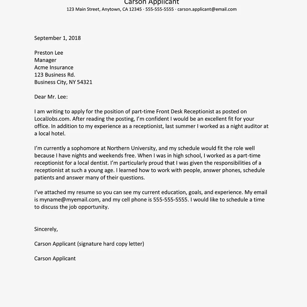
The first impression your cover letter makes can be the difference between getting an interview and your application being discarded. A clean, professional font immediately signals that you’ve put thought and effort into your application. It suggests that you take your job search seriously. A poor font choice, on the other hand, can send the wrong message. It might convey carelessness or a lack of professionalism, immediately putting you at a disadvantage. The right font choice sets the tone for how the recruiter will perceive you. Be sure you make the right first impression.
Readability and Professionalism
Readability is key. The best cover letter font is one that is easy on the eyes. It allows the reader to quickly and comfortably absorb the information. Fonts that are too ornate, stylized, or difficult to read can frustrate the reader and distract from your message. Professionalism is also crucial. The font should project a sense of competence and trustworthiness. Avoid fonts that are overly casual, trendy, or playful unless you’re applying for a role in a creative field where a more unique font might be appropriate. The goal is to find a balance between readability and a professional appearance.
Top 5 Cover Letter Fonts
Here are the top 5 fonts that are great choices for your cover letter, with a closer look at their pros and cons. These fonts are widely used and recommended by career experts for their readability and professional appearance. Each of these fonts strikes the right balance. They are clear, legible, and contribute to a polished presentation. This list will help you make an informed decision, so you can be sure to choose a font that works well for you.
Arial
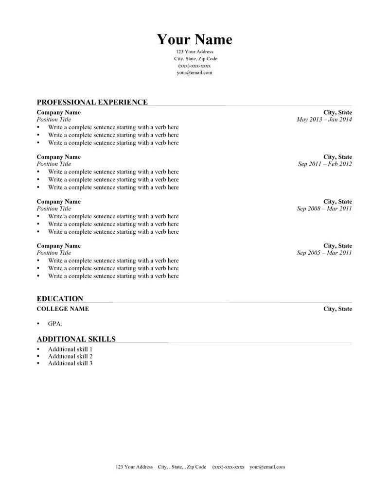
Arial is a widely recognized sans-serif font known for its simplicity and clarity. It’s a safe, versatile choice that works well for cover letters. It’s easy to read at various sizes, making it ideal for both print and digital formats. Arial is a staple in many word processors and is familiar to most readers, making your cover letter accessible and professional. Its clean lines and straightforward design make it a great option for most job applications, conveying a sense of professionalism without being overly formal or distracting.
Pros and Cons of Arial
Pros: Highly readable, widely available, versatile, and universally recognized. Cons: Can appear a bit generic or common, lacking a unique personality. In some cases, it can be seen as overused. Using Arial, however, is not a bad option. Its familiarity can be seen as a positive, ensuring your content is easily consumed. It is also unlikely to offend in any situation, so is a safe bet for many job applications. If the goal is to be safe and accessible, Arial will be a good fit.
Why Arial is a Popular Choice
Arial’s popularity stems from its inherent readability and its widespread availability. It is pre-installed on most computers, making it easy for anyone to use. Its clean design makes it easy to read. This ensures that the focus remains on the content of your cover letter rather than the font itself. This ease of use and its neutral aesthetic contribute to its popularity as a go-to font for cover letters, especially for candidates who want a reliable and professional presentation. Consider Arial to maintain a professional look.
Times New Roman
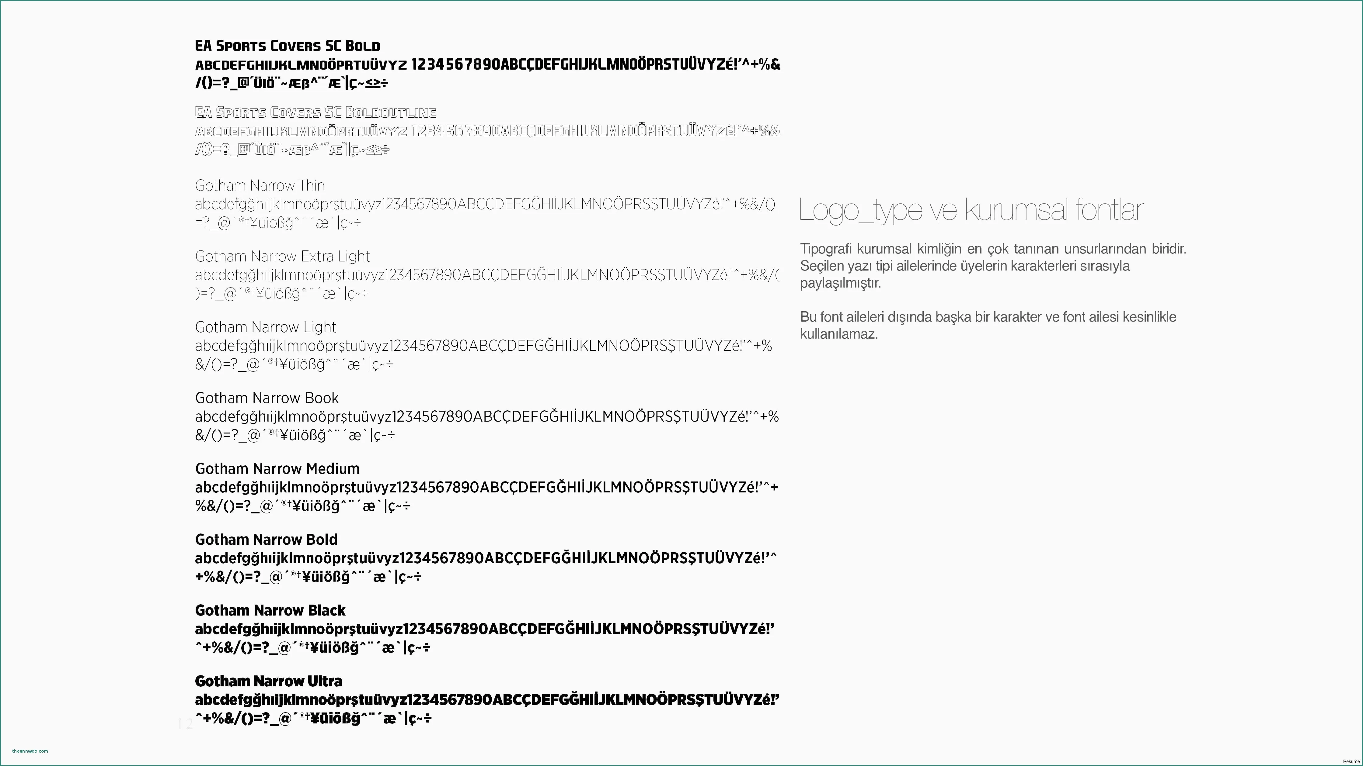
Times New Roman is a classic serif font that exudes tradition and formality. It is a staple in academic and professional settings. Times New Roman is a great choice if you want to project a sense of experience and reliability. Its classic design is timeless, and it provides a sense of gravitas to your cover letter. The serif style can add a touch of sophistication. It conveys a sense of structure and organization. This font is most appropriate when applying to traditional companies and in settings where classic presentation is highly valued.
Pros and Cons of Times New Roman
Pros: Classic and professional appearance, widely recognized, conveys experience and tradition. Cons: Can feel dated to some, may not be the best choice for modern or creative roles, can be a little bit overused. Using Times New Roman is a great choice. Its classic look and feel can be comforting. It’s the type of font that many find themselves defaulting to. But be sure to pair it with the right job for maximum impact. Make sure it matches what the company values.
When to Use Times New Roman
Times New Roman is best used when applying for roles in more traditional industries, such as law, finance, or academia. If you’re applying to a company with a long history or a conservative culture, this font will likely be a good fit. It’s also suitable if the job description emphasizes a need for formal communication. It’s perfect if the company has specific brand guidelines. Ensure that your font matches the expectations of the industry and the company culture. Be aware that there are times when Times New Roman may not be the best option.
Calibri
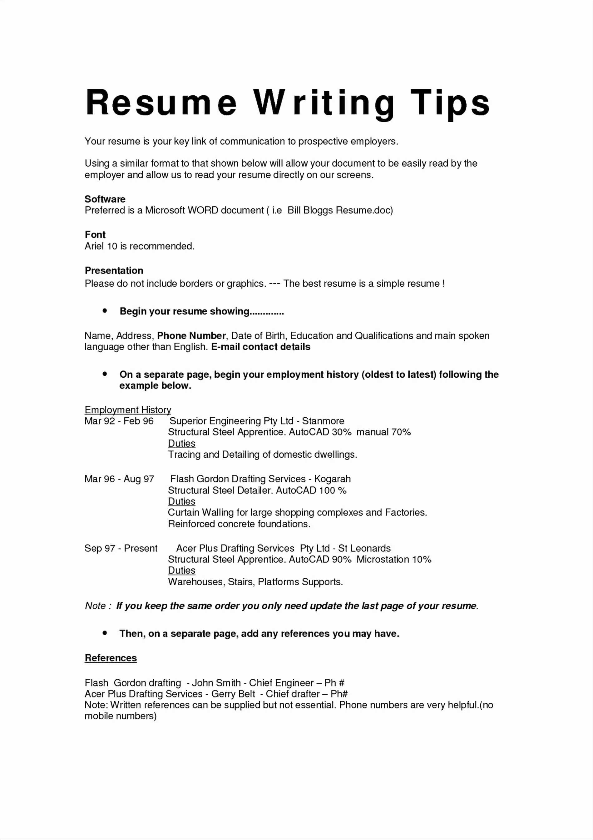
Calibri is a modern sans-serif font that offers a clean and contemporary look. It is a Microsoft Office default. Calibri is a good option if you’re seeking a more modern aesthetic in your cover letter. It is easy to read on screen and in print, and offers a fresh, approachable feel. Its subtle curves and balanced proportions make it a very versatile font. This versatility makes it a great choice across a wide range of applications, from business to creative fields. Calibri also maintains a professional feel.
Pros and Cons of Calibri
Pros: Modern and clean appearance, easy to read, widely available. Cons: Can sometimes appear too common or plain, may lack distinct personality. Calibri is a very accessible choice. But like Arial, it does not always stand out. If you need a font that does the job well, without distracting from your text, then Calibri is a good pick. Be sure to consider the job you are applying for. Make sure the company values the modern approach that Calibri provides.
Calibri’s Modern Appeal
Calibri’s modern appeal lies in its simplicity and its suitability for digital communication. Its clear design makes it easy to read on screens. This is a key advantage in a world where many recruiters view cover letters online. It presents a contemporary image while still maintaining a sense of professionalism. This makes it especially suitable for companies that embrace a forward-thinking approach. If you are applying for a tech startup or a creative agency, Calibri can be a good choice. If a company is seeking someone modern, consider using this font for your cover letter.
Garamond
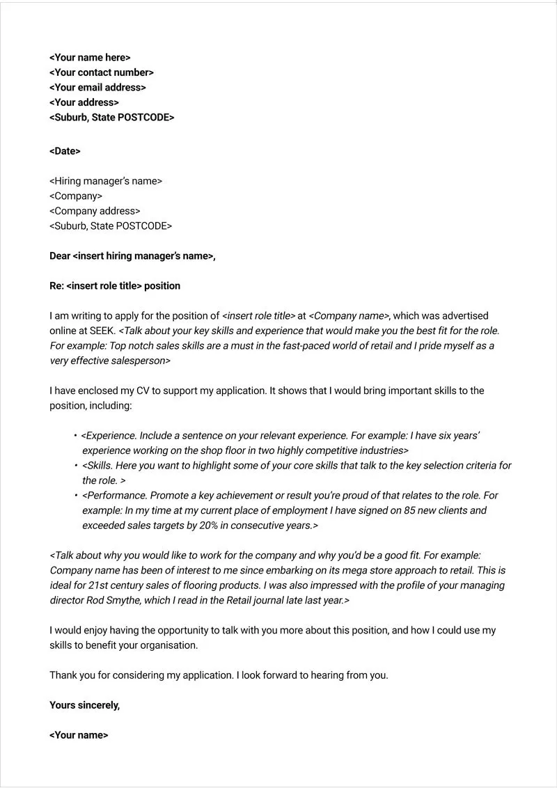
Garamond is a classic serif font that offers a sophisticated and elegant look. It is known for its refined appearance and excellent readability, even at smaller sizes. Garamond is great for making a statement. Its subtle serifs and balanced proportions lend your cover letter a touch of sophistication. It presents you as someone who pays close attention to detail. While it’s less common than some other options, Garamond’s distinct character helps your cover letter stand out while maintaining a professional tone. It is a great choice if you seek to project elegance.
Pros and Cons of Garamond
Pros: Elegant and sophisticated appearance, excellent readability, distinctive character. Cons: Can appear slightly less conventional, may not suit all industries. Garamond is a bit of a different choice than the other ones on this list. But if you’re looking to stand out, while not sacrificing your level of professionalism, then Garamond will be the right font. Make sure it suits the job you are applying for. Ensure that the company’s brand standards align with your font choice.
Garamond’s Classic Touch
Garamond’s classic touch comes from its origins in the Renaissance. It is rooted in the traditions of high-quality printing. It projects an air of quality and attention to detail. This makes it ideal for applications where you want to showcase a refined image. It’s particularly well-suited for fields like design, marketing, or any role where a sense of style and creativity is valued. The use of Garamond can demonstrate your aesthetic sensibilities. In an application where style is of utmost importance, this font should be highly considered.
Helvetica
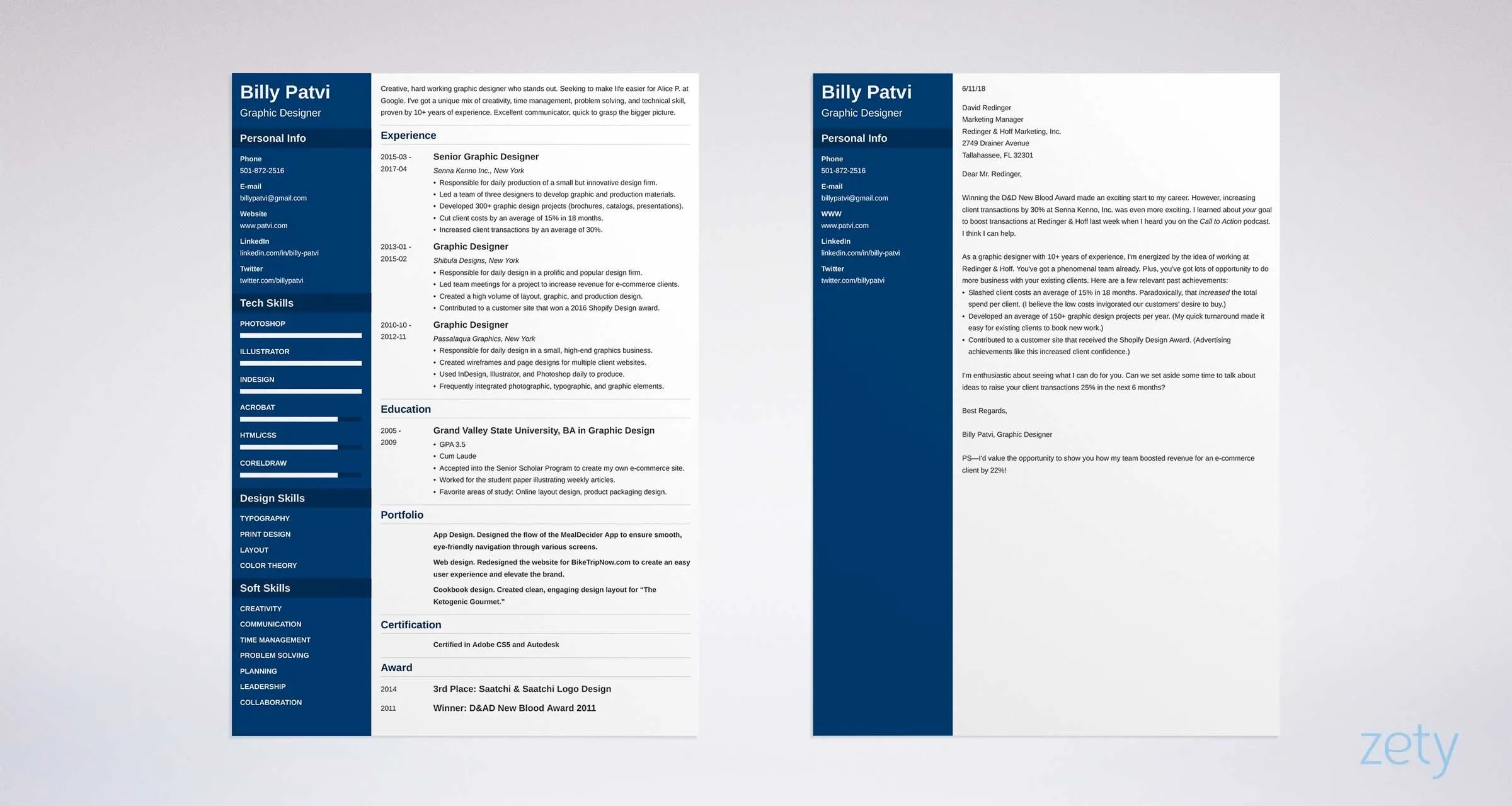
Helvetica is a minimalist sans-serif font known for its clean and neutral appearance. It is a versatile choice that is easy to read. Helvetica offers a modern and uncluttered aesthetic. Its simplicity allows the content of your cover letter to take center stage. It communicates a sense of clarity and precision. This font is often used in branding and design. In the context of a cover letter, Helvetica projects a sense of professionalism. If you are applying for a role in a creative field, then Helvetica is an excellent choice.
Pros and Cons of Helvetica
Pros: Clean and modern, highly readable, versatile. Cons: Can appear generic or overly simple in some contexts, may not project as much personality. Helvetica is a great choice for a job where you want to appear neutral and professional. While it may not be the most exciting option, it gets the job done. It puts the focus on your actual accomplishments, instead of the font. If you want to put the focus on your achievements, then Helvetica is the right choice for you.
Helvetica’s Clean Look
Helvetica’s clean look is its greatest strength. It’s a neutral font that doesn’t distract from your cover letter’s content. Its clear lines and straightforward design make it easy to read. This is especially important in a cover letter. The goal is to convey information clearly and concisely. Helvetica’s minimalist style supports this goal, allowing the recruiter to focus on your qualifications and experience. With Helvetica, it is easy to put all the focus on your accomplishments. It is an excellent option for those seeking a professional role.
Tips for Selecting a Font
Choosing the right font involves more than just picking one from a list. It requires a strategic approach that takes into account readability, industry standards, and personal preference. Consider the tips below when choosing your font. Taking the time to make a great choice will ensure that your cover letter makes the right impression.
Font Size and Spacing
Font size and spacing are just as important as font choice. A standard font size for cover letters is 10-12 points. This ensures that your text is easy to read without taking up too much space. The font size affects readability, regardless of which font you select. Adjusting the spacing between lines (usually 1.0 to 1.15) can also improve readability and make your cover letter more visually appealing. Correctly formatted cover letters look better, and are much easier to read. Proper formatting is vital to your job search.
Consider Your Industry
The industry you’re applying to should influence your font choice. Some industries, like law or finance, favor traditional fonts like Times New Roman. Others, such as tech or creative fields, might lean towards more modern options like Helvetica or Calibri. Researching the typical design standards of the companies and industries you’re targeting can help you choose a font that aligns with their expectations. For example, if you are applying to a tech company, it may be useful to look at the design on their website. This way, you can mimic it in your cover letter.
Testing Your Cover Letter
Once you’ve selected your font, always test it out. Print your cover letter to see how it looks in physical form, as it can often appear different than on-screen. Ask a friend or family member to read it and provide feedback on its readability. This will help ensure that your font choice is effective. Reading it out loud can also help you find issues. Before you apply for a job, always check to make sure you are putting your best foot forward.
Conclusion
Choosing the right font for your cover letter is a small but significant step in creating a professional application. By considering factors such as readability, industry standards, and personal preference, you can select a font that enhances your message and boosts your chances of landing an interview. Remember that your cover letter is a reflection of you, and every detail, including the font, contributes to your overall image. So, take the time to choose wisely, and present your best self to potential employers. With the right font, you’re one step closer to achieving your career goals.
